

I designed a shirt. It’s called “Ice-O-Metric” and is currently available for a limited time at Cotton Bureau. This is the story behind the design.
One of my favorite mobile games of all time is Monument Valley. Inspired in part by the wondrous art of M.C. Escher, Monument Valley and it's sequel, Monument Valley 2, combine impossible objects, perspective, and stunning visuals to make a thought-provoking game of exploration and journey.
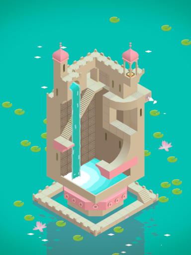
Screenshot from Monument Valley
The use of isometric perspectives in Monument Valley inspired me to play around with the concept in my drawings. I quickly gained a greater appreciation for the quality of the designs in Monument Valley as I struggled to figure out how to draw isometric perspectives. Gradually, my drawings improved to something slightly more appealing. Then I found Isometric.
Isometric is an iOS app for creating isometric perspective designs. You start with a blank canvas and the rhombus shape. Each tap adds a rhombus to the canvas. A second tap on a rhombus rotates the direction of the rhombus 60 degrees. A third tap rotates the rhombus once again. Each of the three directions of the rhombus is a different color. Combine rhombuses to create different shapes or larger rhombuses. Isometric also allows you to customize the colors of the rhombuses. My first design in Isometric was to try to create a simple structure similar to those I admire in Monument Valley.

First structure design in Isometric
Gradually, I started playing with more complex shapes.

Impossible object created in Isometric
Then, I decided to try building the alphabet in isometric perspective.

Alphabet created in Isometric
While still a work in progress, creating the alphabet gave me the confidence to try building something more complex. A few weeks ago, while playing baseball in the backyard with my kids, a familiar tune blanketed the area around us. The ice cream truck paid a visit to our neighborhood. The kids patiently waited for the ice cream truck to stop by our house. I started telling the kids about my favorite ice cream truck treats from when I was their age. Amongst Screwballs and Good Humor Fat Frogs, I mentioned one of their own favorites: the bomb pop. The red, white, and blue popsicle is iconic and delicious.

Screwball and Fat Frog images via Pinterest
Shortly after that visit with the ice cream truck, I started trying to create an isometric version of the bomb pop in Isometric. My first thought was that I should start with the rough shape of a rocket to build the popsicle part of the design. The design started getting weird fast. I ended up with two sticks in the popsicle in my design. The popsicle itself started to look too wide as a result.

An early version with one too many sticks
Eventually, I removed the two sticks and replaced them with a single, centered stick. I trimmed the width of the popsicle and then messed around with the styles and filters in Isometric. I settled on a simple worn style over the isometric base. I exported the design and eventually shared it on Instagram. That was the end of the design, I thought.

The original design
Soon after, I grabbed a t-shirt to put on for the day. It wasn’t just any t-shirt. It was one of my favorites: Chairs Are for Rockin' by MatthewMorse. His art is some of my favorite on the planet.

Chairs Are for Rockin' shirt by Matthew Morse. Image courtesy of Cotton Bureau.
The design of Chairs Are for Rockin’ was super clever and looked great on a t-shirt. I was impressed with the quality of the shirt, too. It was super soft, built well, and fit nicely. I quickly became a fan of Cotton Bureau’s shirts. The combination of cool designs and high quality cotton won me over.
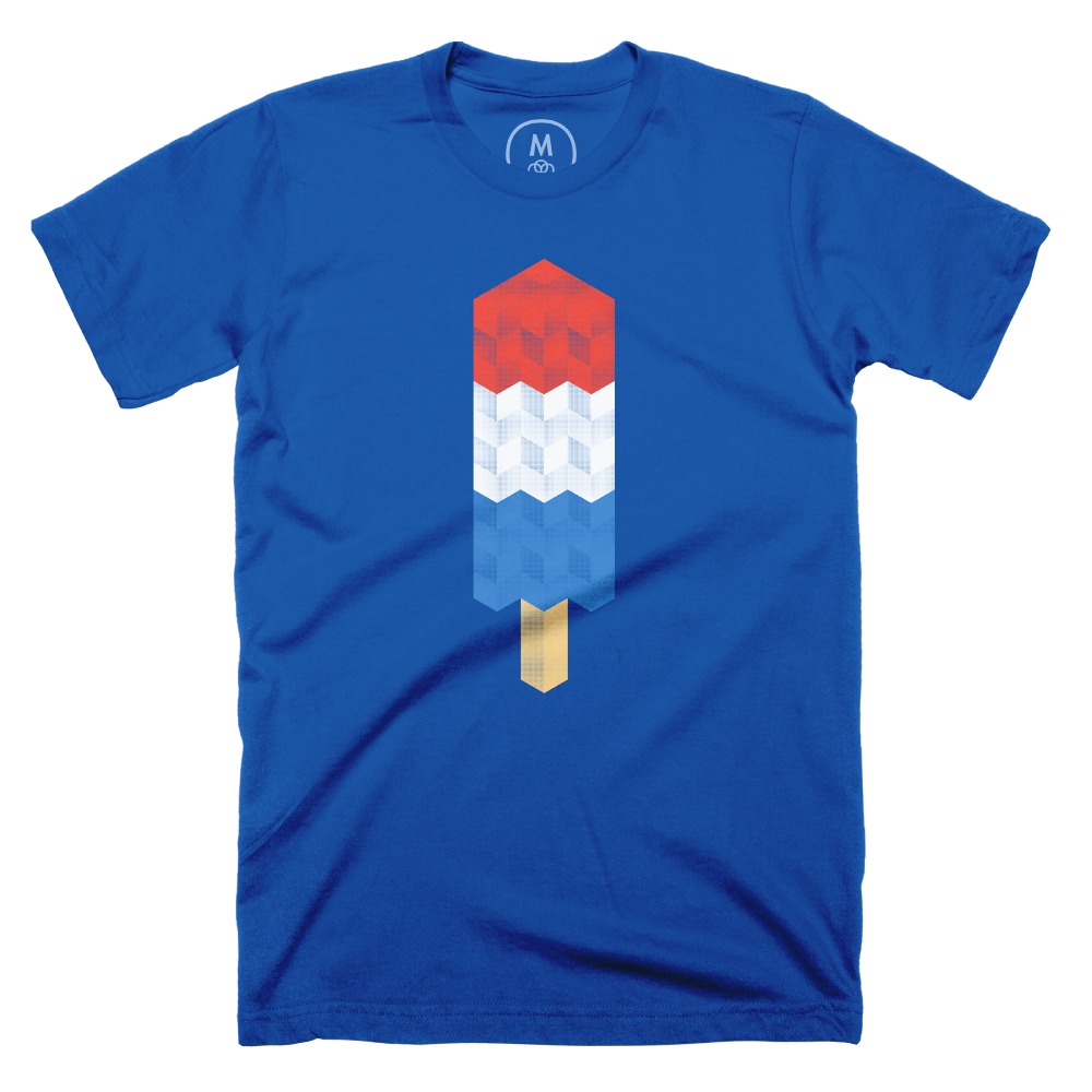
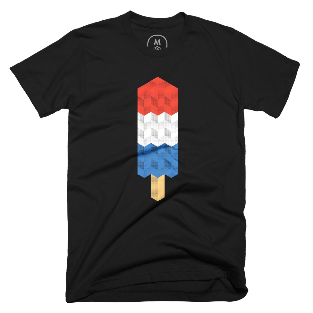
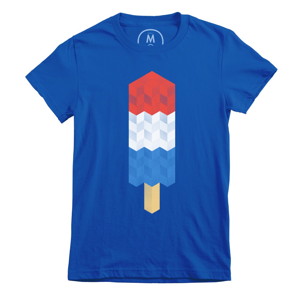
As I put on the shirt that day, I thought how cool it would be to have a Cotton Bureau shirt with my design on it. So, I cleaned up the art of my isometric bomb pop design, added it to a t-shirt mock-up from Cotton Bureau, and submitted it on their site.
Expecting nothing more than a polite rejection email from Cotton Bureau, I was surprised to received a message from them that they liked my design, but there was one major issue. My bomb pop design contained 4 main colors (red, light gray, blue, and tan). For each of the three popsicle colors, there were four variations to define the different rhombus angles. For the tan stick color, there were two variations. In total, my design used 14 separate colors.
The screenprinting process that Cotton Bureau uses limits the number of colors used to keep things economical. The more colors used in a design, the higher the cost. Cotton Bureau prefers to limit the number of colors used in a design to no more than four, although they will use five or six if absolutely necessary.
Cotton Bureau asked me if I could reduce the number of colors I use or try using halftones. The former was not an option because I would lose the isometric perspective if I just removed the variations of each color. So, I set out to create halftone patterns for each of the four main colors. I needed to create patterns with different densities for each color. Using this article from Eli Fitch that Cotton Bureau sent me, I created a palette of halftone patterns for each color in Adobe Illustrator and then replaced the color in each individual rhombus of my design first created in Isometric with my new halftone patterns.

Original halftone design
I sent my new halftone design over to Cotton Bureau. I was happy that I was able to adjust my design in a way that I still liked the finished product. Unfortunately, the print shop reviewed the halftone designed and found a new issue.


The halftone patterns I used were too “loose” in that there was too much space between the dots. The shirt color would dominate the design. The isometric bomb pop did not look good on a shirt now.
So, I went back to Illustrator and increased the size of the halftone dots while decreasing the spacing between them. The process was simple to repeat and shortly thereafter, I sent over a new design to Cotton Bureau.

Final halftone design
They ran a test print to verify that the halftone did not allow too much of the shirt color to show through. They also determined that they would have to print the design on 100% combed ring-spun cotton because their tri-blend and poly-blend shirt materials absorb too much ink. This would cause the small dot details of the design to get lost and muddled.
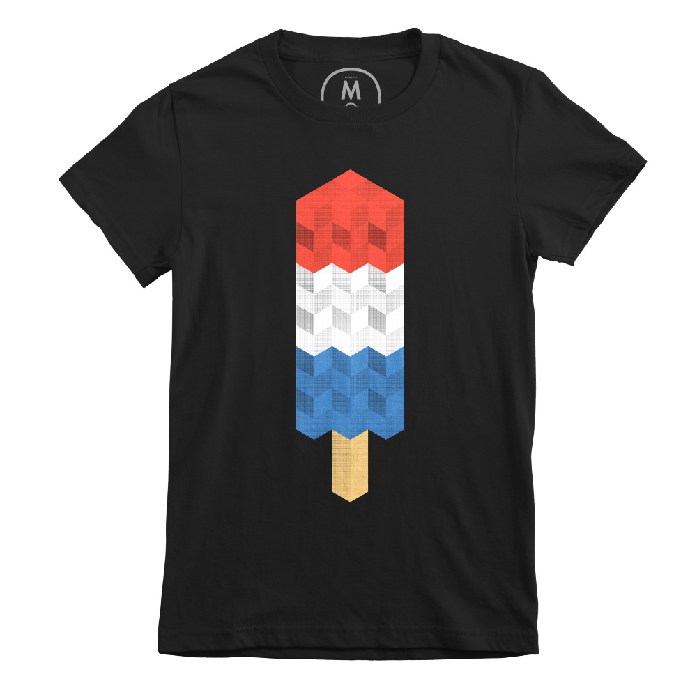
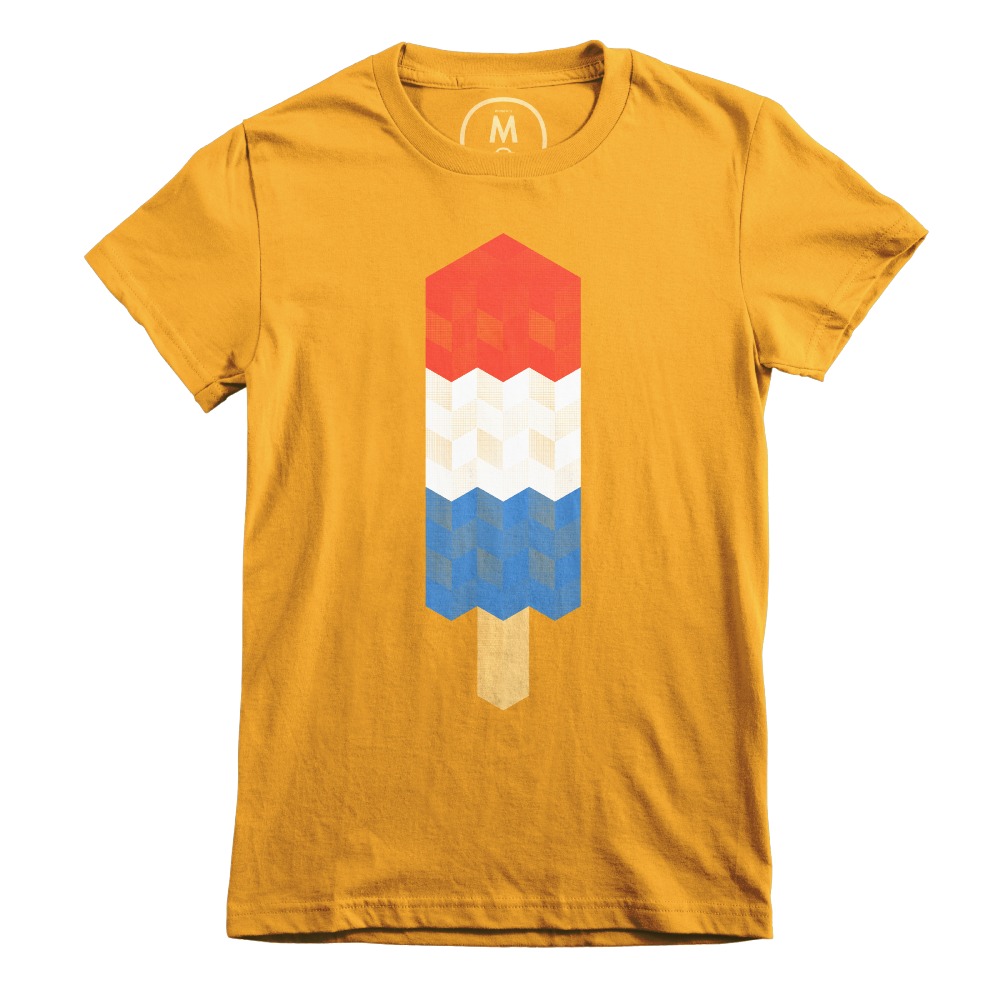
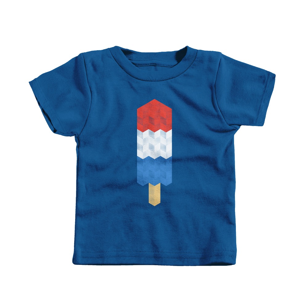
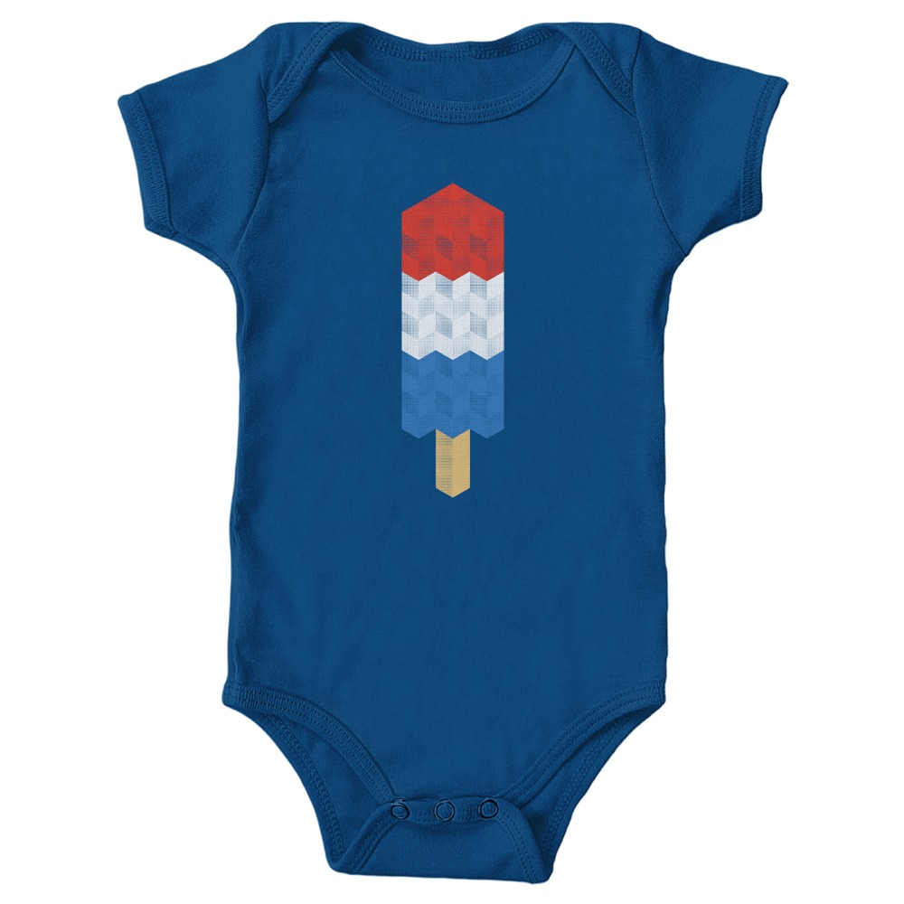
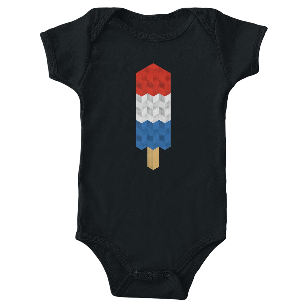
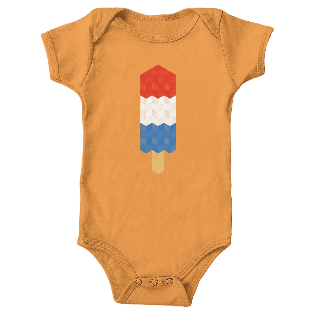
Cotton Bureau suggested printing the design on black and royal blue shirts. The mock-ups looked good to me, but I wanted to something a bit bolder, too. I asked them to check the design on their gold shirt. As soon as they sent me the gold mock-up back, I knew it had to be included. People of all ages enjoy bomb pops, so we decided to make the shirt available in sizes for men, women, and children (including infants).


From Monument Valley to Cotton Bureau, I have learned so much and had an incredible amount of fun along the way. Whether I’m using an iPad, my computer, a fountain pen, or pencil, I consider it a great experience if I can learn and have fun along the way.